Logo instead of the crest in the football club? Why not, currently, the football clubs are greatly prospering companies, and consistent visual identity and brand recognition determine their marketing value on the market. Is it the high time for modern design to enter the world of football?
It may seem so, however, resignation of the long-standing crest for the modern logos is not likely to be seen quickly in football. The attachment to the traditions, the history and the fans' fanaticism will not allow such radical changes in the clubs like, for instance, in the best world league of basketball NBA, where changing logos, and even the club headquarters is common. It is true that we have already repeatedly dealt with changes in the coats of arms or their cosmetic amendments, but the first to decide for the total abandonment of the crest for the new logo was Juventus F.C., and this case had an echo, and was widely discussed in the media, and above all, in the social media. As a long-standing and staunch supporter of Juventus I feel as I was forced to express my opinion on the issue of the new logo. The new design of the graphic symbol of the Club has divided not only the entire community of fans and supporters of Juventus in Italy, but the whole football environment in the world. It, itself, already proves the first small success of this project which was discussed everywhere.
On the picture below, the crest of the Club (a relatively new because it was in force since 2004 and a completely new logo, which will be in effect from July 2017.

On 16th January 2017 an evening gala at the The Leonardo da Vinci National Museum of science and technology in Milan was organized, during which the President of Juventus Adrea Agnelli has unveiled the new logo of the Club, which will replace the current crest on 1st July 2017. Juventus has proven many times that it is not afraid of future investment and brave steps forward, thanks to which it remains light years ahead of the rest of the clubs in Italy, being at the same time, a model of modern management. As you can see, this time the Club made another step forward. "In order to continue to develop, we have to win on the field, but also outside of it, as well as set and achieve new goals. We spent the whole year on the analysis of what the new markets want". – said President Agnelli during the presentation of the logo. Video relation of the gala is available at this link.
In this short text, I will try to examine what the logo presents, what it contains and what was followed by the designers when creating it.
Giovanni Agnelli, the patriarch of Turin, industrialist, FIAT shareholder, longtime president and, without a doubt, the developer of Juventus power, will forever remain in the hearts and memories of the Juventus fans. Out of the many colorful expressions, the fans keep in memory forever the one showing how important and present was Juventus in his life. "I feel emotional every time I see the letter J in a newspaper headline. I immediately think of Juventus".
Magic of the letter J is without a doubt the first thought of each of the supporters of the Old Lady after seeing the new logo which is simple fairly minimalist logo consisting of the letter J. Perhaps, we can be sure that this was the assumption of the designers. The letter J, one, two, three, giving one great J in black and white stripes inscribed in the shield. For those with a lot less imagination, there is a small graphic presenting the probable idea of the designers during creating a new logo.

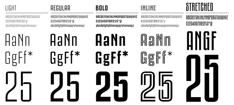
From the technical point of view, the logo was made at a very high level, mentions for designers. The logo is simple, black and white stripes characteristic for Juventus on the exposed letter J, or 2-3 J letters forming a single whole in the outline of the crest , for those with more imagination, the outline of the crest is a shield of Scudetto - the symbol of the Italian Championship. The significant element of the new logo is also the name Juventus over J, which is also one of the five new typefaces of Juventus Fans. Creating own fonts shows what a complete visual identity rebranding taking care of the smallest details was demonstrated by Interbrand agency. The same agency was also the author of the last crest of Juventus in force since 2004.
The project of a new logo exposing the letter J shows in which direction the Club is going in its visual identity. J-Stadium, J-Medical, J mascot, the Club clearly seeks to "appropriate" the letter J itself, which is to be associated and be recognized with Juventus around the world. It is hard to deny this approach from a marketing point of view. The new logo for Juventus, shortly after its presentation, gained the same number of followers as enemies, in the Internet there have been a lot of comments, alterations or memes, some praised it, others protested. Social media seethed This appeal was echoed not only in the Italian peninsula, but the world's media. It is worth noting that the crest of the Club has evolved over the years, but its cosmetic changes did not give rise to such emotions as a completely new logo and resignation of a crest.
In contrast to the disgruntled fans, the Club representatives do not hide their delight. "I fell in love with it, I liked it from the beginning, and I hope that others will like it too. It is innovative, is a breath of fresh air, and it shows how much we want to go forward in the era of the digital world and social media. This is a breakthrough". - Vice President of the Club, former football player and fans' favorite Pavel Nedved just after the presentation of the logo.
For Club activists and marketers, the design of the new logo and the abandonment of the crest s is a step forward, great investment, opening of new markets, in particular, in the age of social media, while for the divided environment of fans, it is usual commercialization of football, departure from history for the profits of the new distribution channels. Will the step Juventus has taken be followed by the next clubs? Is football ready for a new design? I am convinced that it is only a matter of time when the coats of arms will be forced out by the new logos as part of a comprehensive visual identification, and the football clubs (assuming that they are not yet they will be) above all, the enterprises with the history written on the pitch by players representing their club color regardless of the appearance of the crest or logo worn on the chest.
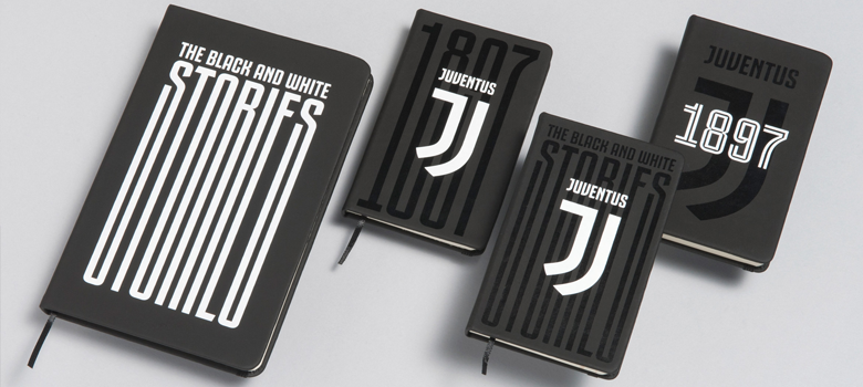
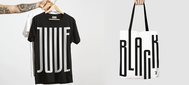
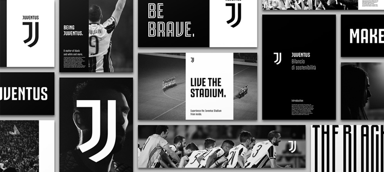
Below, there are a few photos of examples of the use of the new logo in the process of visual identity. It only remains to wait as the Club will showcase new products with its new trademark in a new season.
